Monday, April 23, 2012

Bushnell Final Project

Here are the final projects I created to include in my powerpoint presentation. I was unable to attach the powerpoint to my blog or to my post in module 6 on Angel, I emailed it to Professor Dorsey in hopes that she will have better luck attaching it to my post in module 6. If this doesn't work out I will post the slides on here as pictures for you to view.


Project Description: I created a powerpoint presentation to display my work as a graphic design artist.
Target Audience: My target audience is future employers and future customers/clients.
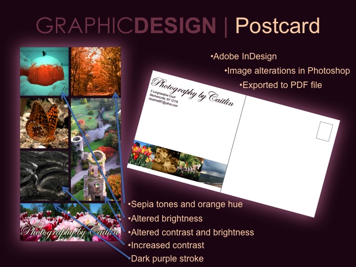
Software used: To create my designs I used Adobe Photoshop, Adobe Illustrator and Adobe InDesign. I used both Microsoft Powerpoint and Adobe Photoshop to create my final presentation.
In my designs I make sure I state when I have borrowed an item such as a photo or a font to create a design.


Here are my slides starting with my cover page:


Friday, April 13, 2012

Bushnell Preliminary 2

Last week I posted slideshow pages of my previous work. This week I have posted 2 new designs that will also be in the slideshow presentation.

The first design is a Save-the-Date card. The picture I used is a few years old and a long time ago I put it on my iphone and changed it a little with an app I had. I used this image for the Save-the Date but first I cleaned it up a little in photoshop. The app on my phone made a lot of dark spots in the image, like under my eyes. I lightened these areas, removed the necklace I was wearing and added a border. I brought this image into illustrator and began to add the text. I created a new graphic style by adding fill colors with different effects and textures. I also created a textured background.

The second design is a wedding invitation. I am not completely happy with this one yet. I want to add more branches to make it longer and curve around the corners and maybe rearrange some things. To create the branches I used the pen tool. I created my own brush to make the branches thin out at the ends. I used the pen tool to create a leaf and saved it as a symbol so I could easily add more leaves. I also used the spiral tool and the twirl tool. I used the same textured background as the Save-the-Date, but I changed the color.

I plan on creating a Response card and a Thank You card that match the invitation.


Friday, April 6, 2012

Bushnell Preliminary 1

I started putting all my work into a powerpoint presentation. I saved each slide as a picture and uploaded them here. So far i have included a logo, a poster and a post card. I plan on adding a 3rd slide for each design to explain more about it.
The last image is one I plan on using to create a save-the-date card.


Thursday, March 22, 2012

Design Competition Final

Here are finished designs I created:

"Conquer"
 "London 2012"

In the "Conquer" design. I changed it to a landscape orientation. I altered the positioning of the text. I decided to make the london 2012 on the bottom larger and I added a blue outerglow and changed it to overlay display.
In the "London 2012" design the only thing I changed was I added a black outerglow to the larger text to make it pop off the page.

Wednesday, March 14, 2012

DC Preliminary Round 2

I was able to finish the tutorial I started originally. I downloaded some water brushes to create the water fall effect. After finishing this I decided to try another tutorial, which is the 2nd design I've posted here. In photoshop,  I created a background out of the phrase. In illustrator I typed "London 2012" and copied and pasted it into photoshop as a smart object. In photoshop I selected the "London 2012," then hid it, rasterized the type layer and then cut and pasted the selection. Then I changed the layer style to "color overlay" with black. I un-hid the "London 2012." Lastly I made a new layer and changed the layer style to add an inner glow of black to make the black border.

"Conquer"

"London"


Friday, March 9, 2012

"Conquer" - Design Competition (Mod 4)

"Conquer"


I chose a design competition from GraphicCompetition.com. It is a typography competition and the theme is sports and the phrase “Its not what you win, but how you conquer it.” This competition was created by a paper brand company called Conquerer and is in the spirit of the upcoming Olympic Games.. The deadline for this competition is April 30, 2012. The grand prize is a 2 tickets to the 2012 Olympic Games in London.

So far in my design I just played around with the text. I was following a water splash tutorial, and I have not finished it yet. I used a picture I took of the Caribbean for the water. I used the lasso tool to select a small section of the water and copied and pasted it to my design. I used the erase tool to fade out the edges of the water and I changed the opacity to 60%. I duplicated this layer 3 times. I moved 2 of the duplicates to the right and left of the original and changed the opacity slightly lower than the original. The 3rd duplicated layer I decreased the size and changed the opacity to 100% then I placed it in the middle of the other layers. On all of these layers I adjusted the levels and curves.
To the C, I applied several blending options, including bevel and emboss, gradient overlay and stroke. On a new layer I made a selection around the C, colored it black and applied a Noise Filter. I changed the blending mode to screen and decreased the opacity.

I did find some other typography tutorials that I liked so I might end up with a entirely different design.


Thursday, March 1, 2012

Kenny Chesney Live album - Final


Ok so I went back into photoshop, removed the background. Made Kenny all in color with the rest of the image in black and white. I then opened it in Illustrator. I found a tutorial on how to create a seamless background in Illustrator. I made a rectangle to fit the background. I added a radial gradient with white and dark gray. I added a second fill color of gray and applied the grain effect. I added another fill color of white. Then added a final fill color and used the 'dashed lines' swatch from the swatch library. I decided to I wanted to add texture to the font so I applied a linear gradiant with white and light gray. I added an additional fill color of light gray and applied the burlap texturizer and changed the opacity to 25%.

Thursday, February 23, 2012

Kenny Chesney Live Album cover

Here is the original:

Here is the cover I created:

I took the image and edited the background of it. I took out the jumbotron and added more of the crowd. I made the image black and white and adjusted the levels (option under image > adjustments). I selected the image using the rectangle marque and feathered the edges. I downloaded a font called Broken Stick from Dafont.com. I originally had the background black which looked nice but I felt like I needed to add some color. Which is why I changed it to blue.

This is where I found this image

Wednesday, February 15, 2012

Recreate in Illustrator - Final

Ok I brought the  live trace image from illustrator back into Photoshop. I used the selection tools and the paint bucket to fix the background to make it all one even color. I used the brush, blur and selection tools to add shadows and highlights.

Friday, February 10, 2012

Recreate using Illustrator

I decided to use an old school photo of my father. I do not know who the photographer is because it is not labeled on the back. This image has been damaged over the years and has many scratches and stains. I scanned the image and used photoshop to clean it up. Then in Illustrator I applied a customized live trace. I still need to play around with it, there is a very noticeable line in the background that I would like to remove. It appeared after the live trace. Any suggestions?

Original:

After editing in photoshop:

After live trace Illustrator:

Tuesday, January 24, 2012

Artist Statement

I found my first real camera in our attic when I was fifteen years old. The camera was my mothers from when she was a kid.  It was a film camera. I was immediately intrigued by its complexity because I was used to the disposable wind up ones. I knew I wanted to learn more about it so I took a photography class the following semester in high school. This was the beginning of my love for photography.

Basically, I like to take pictures of anything I find interesting. I try different angles and at the end of the day I review all of the photographs and see which ones I like the most. In general, I don’t really like to change my photos drastically. I may make minor changes like cropping and seeing how it looks as a black and white. But if I have a special project and I am working on a specific look or theme then I will change a photo to fit this idea.

I am always looking for ways to grow as a photographer. I keep my mind open to new ideas and opportunities to learn. I know there are many areas I would like to work on because I feel like I am just getting started.